
Have you ever debated with someone whether “a thing” is blue or green?
I have; more often than anyone probably should – both in everyday life and while working in context of designs (luckily, color codes make it more of a moot point).
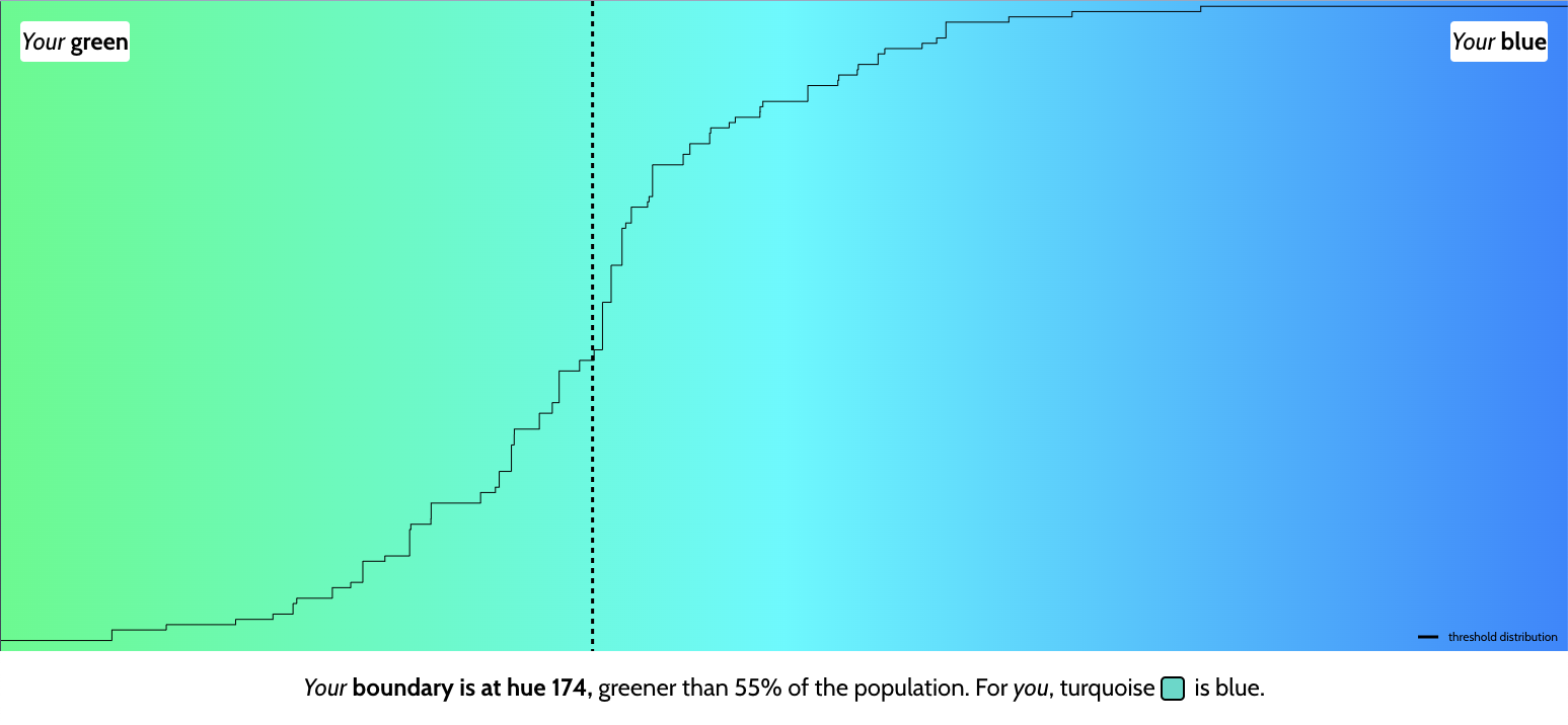
I remember getting a case for my first phone (a Nokia 3310, obviously) sometime in the early 2000s. It was labeled “turquoise”, but to me, it was clearly light blue. A friend of mine, however, insisted it was green.
All of this is basically just to share a link to ismy.blue.
For some reason it scratched an itch I didn’t even know I had 😅
Perception Isn’t Easy (or Neutral)
It’s funny how a tiny thing like a color can highlight how differently we each experience the world — and when you work with digital media, those differences are equally as relevant.
If you can’t relate to my own experiences with “turquoise”, then think of that famous viral photo of The Dress aka “The Dress Phenomenon anno 2015” that caused such chaos – same pixels, different brains (is it blue/black? is it white/gold?).

Applying the same reflection to digital media, then screens display colors differently depending on calibration, viewing angles, lighting conditions, and our own brains filling in gaps (a phenomenon known as color constancy) all play a role.
It’s not just color, either: even layouts, typography, and the general “feel” of a design are shaped by small human biases we don’t always notice.
So next time someone says “turquoise”, maybe it’s worth asking if they mean green or blue – or maybe it’s worth remembering that we’re all looking at the same thing a little differently 👗